 |
View in Browser |
|
|

|
| Fonts used: Helvetica Now Variable and Wonder |
| Our Top 25 BEST New Fonts of 2021 SALE is almost over. Must have best-selling fonts matched with must have SAVINGS! Check out more fonts from our list and don’t forget to scroll through and check out more designer interviews.
Best of 2021 Sale ends January 25th at 11:59 p.m. EST! You won’t want to miss out! |
|
| TT Travels Next |

|
| #10 TT Travels Next |
| by TypeType |
| We've expanded the range of stylistic alternates and added a calmer version for lowercase letters t f, uppercase Q, and ligatures fi ffi fj ffj. Thanks to the calmer alternative characters, TT Travels Next can be used in more conservative layouts or in designs that require a certain austerity.
About TT Travels Next: The idea to create an alternative version of the TT Travels font family emerged at the "Mail.ru Design Conf x Dribbble Meetup" that took place in August 2020 in Moscow. All conference branding was designed using the TT Travels font family, and, even though the set was very beautiful, we found that if the typeface were more radical and display, it would have complemented the event's graphics even better. Thus, was born the idea for the TT Travels Next typeface, which was to create a very trendy and modern wide display sans serif for use in different sets, be they print or web. TT Travels Next is an experiment answering the "what-if" question of what would happen if the original TT Travels looked different, less compromising and more radical. The typeface has very wide proportions and characters that almost do not get narrower as you move from the bold styles to a light one. TT Travels Next has an exaggerated closed aperture, low contrast, noticeable visual compensators, and a harmonic combination of soft and sharp shapes 21 fonts for |
|
 |
| Let's hear from the Designer. |
| Q1) Where did the idea for the typeface come from? Did you set out to address a specific use or suite of the application? Was this a design you'd had in mind for a while?
I gave myself the task to rethink the original TT Travels font family, make it more modern and fashionable, while adding a display look and brightness to the design. I was inspired by the letter a from in original TT Travels, as it has a bright character and an interesting plasticity, which I wanted to build on. The process of creating the design went quite fast. The most difficult part for me was to determine the direction of work. I had so many ideas and thoughts, I had to limit my imagination. Q2) What is the one or two most important things graphic communicators should know about the typeface, or how will the family of fonts help them create better design? The important thing to remember when using TT Travels Next is that it is a display typeface that looks good in medium to large sizes and should not be used for setting blocks of small text. It is best to use TT Travels to create bold accents, adding it here and there in your project. The typeface can be ideal for large headlines, posters and exhibition design, where noticeable attention-grabbing letters are needed. It is also a good choice for packaging design, because the shape of the glyphs are conducive to experimenting with materials. 21 fonts for |
|
| Vary |

|
| #11 Vary |
| by Monotype |
| Vary by Olli Meier is a geometric sans serif typeface inspired by Bulgarian Cyrillic.
Vary is fun and adaptable and was built with three feelings (variations): classic, modern, and loopy, offering an opportunity for designers to be playful in their creations. The inspiration in Bulgarian Cyrillic is seen mostly in the character "g," which was inspired by a very uncommon handwritten "?" spotted by the designer in a shop window in Sofia, Bulgaria. When he flipped this design in 180°, the Latin character ‘g’ was born for Vary Another example is the "R" in the modern stylistic set, which was inspired by the handwritten Cyrillic character "?". Vary is available as a variable font and also comes with 10 preset instances from Hairline to ExtraBlack. 11 fonts for |
|
 |
| Let's hear from the Designer. |
| Q1) Where did the idea for the typeface come from? Did you set out to address a specific use or suite of the application? Was this a design you'd had in mind for a while?
I traveled to Bulgaria, In February of 2017, where I was surrounded by Bulgarian Cyrillic script. My niece, then six-years old, had just started learning to read and write the Latin and Cyrillic alphabets. We were both equally interested and fascinated by the letters – yet looked at the glyphs quite differently. One night, while walking past a shop window, I noticed a strange glyph that looked like an asymmetrical B. When flipped 180 degrees, it looked like a funny lowercase g. This was the starting point behind the Bulgarian inspiration of the Vary typeface. Q2) What is the one or two most important things graphic communicators should know about the typeface, or how will the family of fonts help them create better design? Before working at Monotype, I was a freelancer for branding and corporate design projects. Vary is a well-stocked, flexible toolbox for designers. It offers many alternative characters that help develop individual logos, brand marks or a series of product names. Editorial design often features strong contrasts: large/small, thick/thin. The variable version of Vary offers 10 preset instances from Hairline to ExtraBlack, and hundreds of variations in between. Vary also works in the office for business reports, charts, and in presentations. Nut fractions, or stacked fractions, that position the figures correctly – even in Microsoft Word, via Stylistic Set 01 – are included in the Vary character set. 11 fonts for |
|
| Coco Gothic Pro |

|
| #12 Coco Gothic Pro |
| by Zetafonts |
| Inspired by a biography of Coco Chanel and trying to capture the quintessential mood of classical fashion elegance, Cosimo Lorenzo Pancini designed Coco Gothic looking for the effect that the first geometric sans typefaces (like Futura, Kabel or the italian eponyms like Semplicità) had when printed on paper. The crisp modernist shapes acquired in printing charme and warmth through a slight rounding of the corners that is translated digitally in the design of Coco Gothic. This signature touch is enhanced by the inclusion of light humanist touches to the proportions of the letters, resulting in the unique mix that makes Coco Gothic one of our best sellers, with a look that is both contemporary and vintage.
After six years from the original project (that has spawned in the meanwhile successful families like Cocogoose and Coco Sharp), we went back to the design to completely redraw and expand the original family, creating with a Pro version that has better on-screen readability, a wider weight range, variable type versions and more language coverage (with Coco Gothic Arabic adding a new script to the latin, greek and Cyrillic of the original). Coco Gothic Pro comes in three subfamilies, each with seven weights with matching italics and featuring an extended character set with open type support for small caps, ligatures, alternates, European languages, Greek and Cyrillic alphabets. The original, body-text optimised Coco Gothic and Coco Gothic Alternate subfamilies have been kept for compatibility with the previous version, while a new Coco Gothic Display subfamily has been developed with a complete redesign aimed at display usage, featuring tighter spacing and optimised letterforms. 48 fonts for |
|
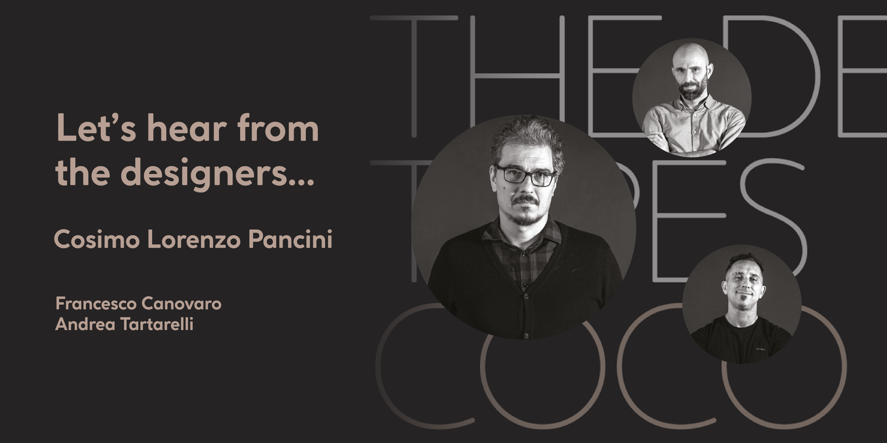 |
| Let's hear from the Designers. |
| Q1) Where did the idea for the typeface come from? Did you set out to address a specific use or suite of the application? Was this a design you'd had in mind for a while?
Coco Gothic Pro was inspired by Coco Chanel. In it, I tried to capture the quintessential mood of classical fashion elegance. I designed Coco Gothic, looking for the effect that the first modern geometric sans typefaces, like Futura, Kabel or Semplicità, had when printed on paper. The crisp, modernist shapes have a charm and warmth, brought about through a slight rounding of the corners. My goal was to capture this demeanor and translate it into the digital designs of Coco Gothic. This signature effect is enhanced by the inclusion of light humanist touches into the letter shapes. The result is a unique melding that makes Coco Gothic Pro both contemporary and vintage. Q2) What is the one or two most important things graphic communicators should know about the typeface, or how will the family of fonts help them create better design? Compared to its previous incarnation, Coco Gothic Pro aims at providing a better on-screen readability, a wider weight range, variable type versions and more language coverage. (Coco Gothic Arabic adds a new script to the Latin, Greek and Cyrillic versions of the original family). A distinguishing feature is the inclusion of ten alternate historical sets, that allow designers to use the typeface as a typographic "time machine," by selecting letterforms ranging from Art Deco and Art Nouveau to Modernism and 80’s minimalism. Equipped with such an array of historical variants, Coco Gothic Pro becomes an encyclopedia of styles from the last 130 years, ready to transform itself and adapt to the mood of any text. 48 fonts for |
|
| Mont Blanc |

|
| #13 Mont Blanc |
| by Fontfabric |
| A new type giant emerges taking after the legendary geometric sans serif Mont!
Mont Blanc elevates all prized unique details of Mont and translates them into an independent flawless text font family. This type prodigy comes with heaping legibility improvements dedicated to the smaller sizes and challenging paragraphs. The new type family is set to climb to the top of your "favorite design tools" with adjusted x-height, refined weight, and glyphs redesign to name but a few. Venture into new projects equipped with 8 font weights and matching italics, multi-script support, and rich OpenType features set. 18 fonts for |
|
 |
| Let's hear from the Designer. |
| Q1) Where did the idea for the typeface come from? Did you set out to address a specific use or suite of the application? Was this a design you'd had in mind for a while?
I got involved with the Mont Blanc project when the geometric giant, Mont family, was about to be expanded with an independent text companion. It was up to me to make the right design decisions and adjust its technical specifications without losing the distinct character of the original design. Q2) What is the one or two most important things graphic communicators should know about the typeface, or how will the family of fonts help them create better design? Mont Blanc is a perfect match for its display counterpart. It features a more subtle characterization while retaining the geometric elegance of the family. Effortless legibility was accomplished by adjusting the sharp details of the letters and further balancing the x-height and the contrast of the letterforms. 18 fonts for |
|
| Ionic No 5 |

|
| #14 Ionic No 5 |
| by Monotype |
| Ionic No5 is a refresh of a classic Linotype Clarendon-style serif, another restored classic from the Monotype library, much like the recent updates to Walbaum and Helvetica Now. The original typeface was designed to be printed and read at small sizes, popular with newspapers in the 20th Century at its birth. The restoration and refinement of this typeface has bestowed a greater sense of clarity and directness, smartly stylish, and an utterly captivating appeal.
Because these styles were so popular for books and newspapers for so long we associate them with being editorial or bookish, not dull, but thoughtful. Designers today can use that association to their advantage as a visual shortcut to convey similar meaning and tone. More attention was given on modernising the typeface with precious use and the introduction of sharp edges & finishes. The thinnest weights can give a dancing typewriter aesthetic, being low stroke contrast. The heavy weights have an unquestionable presence on the page. Overall, the typeface has a richness and almost illustrative quality about it. The true depth of Ionic No.5 could enable each weight to be a poster by itself. 10 fonts for |
|
 |
| Let's hear from the Designers. |
| Q1) Where did the idea for the typeface come from? Did you set out to address a specific use or suite of the application? Was this a design you'd had in mind for a while?
Clément Charbonnier and I were both fans of the original Ionic No 5, designed by Linotype, in 1925. We thought it was a worthy design for revival, so we set out to make our own. Designing a typeface in a collaborative manner was fun, we confronted ideas and challenged each other. As Clément is a graphic designer, we tested the typeface in real-life projects during the design process, which was immensely helpful. Ionic No 5 is initially a press typeface. But because we made some radical design decisions, the new revival lends itself to large sizes, identity projects, luxury brands, and much more. Q2) What is the one or two most important things graphic communicators should know about the typeface, or how will the family of fonts help them create better design? Ionic No 5 is a relatively small family, but each weight has its own purpose. The Regular and Bold weights work very well at text sizes. The extremes of the family can be used on their own. The Black weight offers striking contrast and shapes for maximum impact. The Light weight can be used on its own for its typewriter aura. The italics are cursive in construction and have a very distinct demeanor from the Romans. Ionic No 5 offers a very broad palette of expression for graphic communicators. 10 fonts for |
|
| Halenoir |

|
| #15 Halenoir |
| by Ckhans Fonts |
| Halenoir is a modern sans serif with a geometric touch that support for 28 languages. It comes in 10 weights, 102 uprights and its matching outlines, Obliques, pattern, so you can use them to your heart’s content, in each of which there are more than 801+ glyphs.
Halenoir is composed of 3 types: Original, Compact, Expanded, and each is designed to be suitable for mobile, graphic, and editorial design. Halenoir comprises 102 fonts, consisting of three distinct optical sizes: Display and Text. Each one has been carefully tailored to the demands of its size. The larger Display versions are drawn to show off the subtlety of Halenoir and spaced with headlines in mind, while the Text sizes focus on legibility, using robust strokes and comfortably loose spaces. In the typeface, each weight includes extended language support, fractions, tabular figures, arrows, ligatures and more. 110 fonts for |
|
 |
| Let's hear from the Designer. |
| Q1) Where did the idea for the typeface come from? Did you set out to address a specific use or suite of the application? Was this a design you'd had in mind for a while?
My interest in typefaces and typography emerged while I was doing graphic design for a living. I had a strong interest in getting to know more about letters and started by trying to recognize typefaces. All my ideas are found in numerous sketches and surrounding objects. Q2) What is the one or two most important things graphic communicators should know about the typeface, or how will the family of fonts help them create better design? I developed Halenoir with the aim of creating a typeface that can be used in a wide range of different sizes, from small continuous text to large headlines. Its main focus on graphic design is also reflected by its name. Halenoir stands for "Hale" "noir" typeface. The advantage of fonts that can be used for all sizes is that it’s always the correct font being used. This can be an important quality, since a typeface for graphic design is not only used by professionals but also by laypeople. Halenoir provides basic icons that can be created automatically according to specific guides. For example: by typing "#CAFE," you can create a Café icon. 110 fonts for |
|
| Code Next |

|
| #16 Code Next |
| by Fontfabric |
| 10 years later, one of the first geometric typefaces in our portfolio and a popular favorite of yours is rising to a whole new level!
We’re revealing the stand-alone type family Code Next—a staggering evolution from Code Pro in functionality, versatility, and application. The transformation includes 6 new weights, 10 new Italics, full support of Extended Cyrillic and Greek, full redesign and glyphs refinement, 2 variable fonts, to name but a few. Going back to 2011, the grotesque-inspired Code Pro was designed to complement memorable pieces that make a statement. Balancing between stylization and simplification, it was encoded with the distinct voice of basic organic shapes to stand the test of time. Little did we know, it would expand and live up to the potential of a "font from the future" as the new Code Next. Today, a type family of 22 styles, this geometric sans solidifies its relevance and carries a strong constructive aesthetic through simplified forms with a twist. These fit any modern design in print, web, and display visualization. Developed to go above and beyond, Code Next comes prepared for multi-script projects with Extended Latin, Extended Cyrillic, and Greek. 22 fonts for |
|
 |
| Let's hear from the Designer. |
| Q1) Where did the idea for the typeface come from? Did you set out to address a specific use or suite of the application? Was this a design you'd had in mind for a while?
Actually, Code Next is the extended and improved version of another Code font of mine that was awarded Most Popular Font of 2011. Even then, DJs, in the electronic music industry, recognized it as their go-to font for concert posters, because of its winning combination of edgy geometry and excellent legibility. Q2) What is the one or two most important things graphic communicators should know about the typeface, or how will the family of fonts help them create better design? This new version, boldly named Code Next, retained the unique details and typeface characteristics of its predecessor. It’s also scaled-up to go beyond specific industries and become a modern workhorse geometric sans serif. If you’re on the lookout for a distinct and foremostly legible geometric font that plays well with almost any modern serif (thanks to its generous x-height and more), then Code Next is the way to go. 22 fonts for |
|
| National Forest |

|
| #17 National Forest |
| by Rachel Kick |
| National Forest is a font duo inspired by the National Park Service signs that are all made using a router bit. It was designed to put the timeless nostalgia of national park signs into a digital typeface.
National Forest has a quirky, retro style and its’ natural imperfections add to its’ charm. The script and print compliment each other well for branding, display or marketing. 5 fonts for |
|
 |
| Let's hear from the Designer. |
| Q1) Where did the idea for the typeface come from? Did you set out to address a specific use or suite of the application? Was this a design you'd had in mind for a while?
I was inspired to create this font after visiting National Parks around the U.S. Each park uses the same style of signage with the park's name engraved using a router bit. This makes the letters unique and full of character. I wanted to create a typeface that encompasses the National Park nostalgia while maintaining the sign's natural imperfections. Q2) What is the one or two most important things graphic communicators should know about the typeface, or how will the family of fonts help them create better design? I designed this font to replicate the nostalgia of the U.S. National Parks Service. The script's imperfections and lack of polish make designs feel authentic and approachable. The print follows the same line as the router-bit used to carve the original signs and perfectly complements the script. 5 fonts for |
|
| Our Best of 2021 ends January 25th, Shop ALL font deals now |
|
